Pages

Wednesday, 3 November 2010

The Industry

Barbed Wire jan 1980
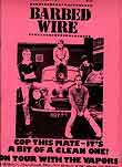
"Barbed Wire" 1978-1980. Genre:Punk
It was 40p/30p for a 20 page magazine on punk music. It was published in Guildford, Fred Pipes. It followed in the footsteps of "private eye" in using new technology. All the copies made where sold in local Record shops. It was hand stapled and was very popular in school's and colleges in Guildford and Surrey - it was also sold at local schools and colleges. To me this magazine doesn't flow like every other day to day magazine that we have in these days, but you can see how it works with its genre, punk. The pink background and overall colour pink works, it stands out and is in your face, I like the bold black text on the bright pink background, it's very bold and would definitely get my attention in a stack of magazines. The masthead for this magazine is bold and catchy 'Barbed Wire' is a different masthead to any magazine you see these days. It doesn't really look like a cover, originally I thought it was a poster but I read on and found out it was a popular magazine in the late seventies. The main featured article looks just to be a band going on tour, nothing more, no small featured articles just the one, but it works as they are obviously a popular band.

Mixmag clubbing magazine cover
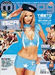
"Mixmag" Made in London from 1983+ it was a monthly magazine, prices range from £4.20-£3.85 it was said to have sold 33,376 copies a month. The magazine featured a number of genre's of music from dance to DJ. I really like the colour scheme the white text on the bright blue background. The central image doesn't really have anything to do with music, but it does look like your typical music video girl. The masthast is hidden beneath the cover girl but it was a popular magazine ,so if most people read the magazine they would probably have been familiar with the masthead. There are lots of featured articles down the side of the magazine and around the ears of the magazine. You can also see some kind of flash, advertising Ibiza, it isn't the typical shape for a flash, but it does make Ibiza stand out.


Play Music November 2006
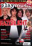
Gaeona Bay Published this magazine. Editor Barney Jameson. It is a local magazine in Kent and is a monthly magazine from November 2006+
This is the first issue of the magazine and was sold for £3.50 and had a free CD it also contained 212 pages of music info ect.. The first three issues featured: Razorlight, Panic at the Disco, The Gossip & Klaxons; My Chemical Romance, Deftones, The Young Knives & Plan B; The Automatic, Taking Back Sunday, The Futureheads and We Are Scientists. The magazine later changed the name too Play Music Pickup. I really like this magazine cover. For me the central image and type set are very good they are bright and bold. The central image is straight forward, a band - razorlight - all using direct mode off address, its catchy. The featured articles look very good and Razorlight are clearly the leading article, which is extremely bold and eye catchy, I really like this cover.


Q first issue
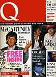
"Q" is personally on of my favourite magazines. I like all the music it has in monthly and the genre of music varies on each page. The first issue was designed and created by Editor Mark Ellen, editorial director David Hepworth and art director Andy Cowles. They released the very first Q magazine together and its main feature was Sir Paul Mccartney. Q is my all time favourite magazine, this is a very good first cover, its Sir Paul Mccartney on the cover, a musical Legend and for him to be on the cover of the very first magazine is a good way to start. The amount of bands and featured articles on the cover is very detailed and you can see exactly what you are buying. The masthead is simple, Q, each month. It is so popular that most of the time the masthead is hidden beneath the central image. You mainly always see the colour red on the cover of Q as red seems to go with all kinds of music. There are always a number of featured and leading articles in Q and there is always a lot going on, on the cover which I like.
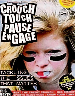
All the information is from www.magforum.co.uk


March 2011, Q
This is a Q magazine which I have labelled. I have labelled the cover with all the terminology that I have learnt so far, varying from mastheads to flashes. I didn't know much many of the lexical terms used for media, but I have now gained a wide range of new words, I can write about magazines and go into detail about where the masthead is or the main featured article. I struggled at first because there are quite a few terms but I have remembered and learnt all the terminology and can use it when talking about any cover or magazine.

Producers and Distribution.
Bauer Verlagsgruppe logo2.png
The Bauer Media Group is a  German publishing group based in Hamburg. It operates in 15 countries worldwide it was founded in 1875 and it has been privately owned and under the Bauer management ever since. They publish around 38 million magazines each week. The Bauer company take care of the magazine Q. They are the Producers and Distributors for Q, they have created a Radio station for Q and also a TV channel. Q also has an awards ceremony every year,  the Q Awards have become one of Britain's biggest and best publicised music awards.
 represented by Bauer.


The Intermedia Partners Group was founded in 1988 by Leo Hindery Jr. iIntermedia's a private equity investment fund focusing on the media industry across all platforms - television, radio, publishing, Internet and marketing. Intermedia Partners is well known for working with VIBE the music magazine. InterMedia’s Senior Partners have over 50 years of operating experience.


History

All my history is from Google Books
( http://www.google.co.uk/search?tbm=bks&tbo=1&q=music+magazine+histroy )
I did a simple search for 'music magazine history' and here are some of the things I found on Google.

This is a book by Jenny Mckay and she talks about all the things you need to create a music magazine Handbook. She talks about what a standard music magazine or just a magazine should have in its contents from interviews to information on contacts. I found it very insightful as I know now what I need too add to my own music magazines contents page.
 
This is a book called 'The Magazine Publishing Industry' written by Charles P. Daly, Patrick Henry and Ellen Ryder. The writers are all industry consultants, place the socail, technological and economic aspects of the Magazine Industry. This book contains a number of points, an all inclusive approach to the business. It explores advertising, circulation principles, production, editorial techniques and a current state of the industry and the inner workings of magazines. There are a number of quotes on this particular page referring to magazines 'not just being a pound of paper' they also say that 'A magazine is a bunch of people with special interests and ideas communicating with a larger group who share the dedication to those interests' Those particular quotes where written by John Mack Carter (1981) and they are both very interesting and he is obviously a dedicated writer.

Preliminary Task


This is my picture that I started with. I didn't particularly like the background as it's quite dim and dull it doesn't have any flare to it.The camera angle I chose was mid-shot. I think a mid-shot works extremely well for a cover picture as you can see everything you need too see. I edited all of my pictures on Adobe Photoshop. I started off with just removing the lines in the wall, I thought this would make the entire background have the 'pebbly' effect, but it didn't really have any effect it just looked dull, so I decided to remove the background all together. I made the entire background white, by selecting the magic wand tool and selecting the entire background and deleting it. I then used the paint brush tool to run around the edges of the picture so that there weren't any bumps and messy edges as that wouldn't look very professional. I finally made the selected background white and transparent so that it would go onto my cover of my school magazine and not have any problems with other pictures being placed in front of it or behind it. It makes things easier and more convenient. Another thing that doesn't work on this picture is the girl on the left has a section of hair in the wrong place above her right eyebrow, I think I will be able to take this out on photoshopOverall I really like this picture. However, I think the background lets it down, it would have looked better if it was taken in a photography studio, using high key photography. But at the time I didn't have the facilities to do this, so next time I need to take a photograph, I will take it in a nice area or try to put the main focus in front of a white wall so that it is easier to edit. The colours are vibrant and the sun is obviously shining.
This is the end result. I am wanting to use this photograph for the cover of my magazine. I am glad I decided to change the background into a plain white background. I think it does definitely bring out the colours of the clothes and the entire picture. I also used the 'burn and dodge' tool on Adobe Photoshop to enhance the light on the faces. This has definitely worked as everyone is glowing but they also have a darker tone to there skin, which allows the background to appear whiter and also the other colours to look brighter. I made a small mistake as I tried to make Jamie's hair (top left) darker as the root's of his hair were quite dark so I wanted it to blend in with the rest of his hair, I selected his hair and enhanced the colour but I may have made it look unnatural, fake and also a lot brighter, however I think it works as you cannot really see the roots in his hair and it does blend in. Overall I think I did a great job of editing the background and making sure that there were no mistakes around the edges and was sure that the picture was smooth and not pixelated.
This is the mock magazine I started with. I drew it on an A4 plain white piece of paper, I wanted it simple and sophisticated. It did start off as a very simple and straight forward design. I wanted to add lots of colour so that it would stand out, however I didn't want it too look unprofessional, I wanted a mature yet sophisticated looking magazine. So I decided to go with a main picture with a group of people using direct mode of address to attract the readers eye. I took the picture in mid-shot so that you could see there bodies and there heads but you couldn't see there feet as it would have made the magazine look smaller. I also ensured I had lots of interesting and colourful pictures around the ears of the magazine. I wanted the main featured article to be bold and stand out so I placed it on the left and in bold text. I think it stands out but I could do more. I wanted to add a flash onto the magazine as they are also very popular on most magazines, usually stating the freebies in the magazine or a low price of the magazine. I wanted the dates to be visible but not too eye catchy as you want the readers to be interested in the cover contents or featured articles not the date. My mock clearly doesn't look good drawn out, but I have never used InDesign before and it could be a challenge, so I wanted to try and keep it as simple as possible, yet still enough work so that I can work on my skills.

This is the 'Ashfield post 16' school cover that I originally drew, I then edited it on Photoshop so that I could see in more detail as to what I want it to look like. I still think I can do it better but this is the outcome I have after a few lessons of tweaking. I wanted a blank page with a mastheadcentral image and a few featured articles. I wanted it to look like a more mature and sophisticated magazine, I started with that idea,I am now intending on adding a central image of some students which I am now editing. This is a very eye catching cover; it has a mix of colours and catchy slogans. The colours around the mastheadPhotoshop after it was scanned in, it does look good but not as professional as what I would like. The bottom section of the magazine is quite detailed and does look to heavy for the front cover, it was supposed to be a small short slogan but I added too much text and it just looks too much and needs to be shortened, the syntax is conversational yet informative, it is about a student discount cards for sixth formers, which is interesting, but you get the all the info on the cover, it doesn't look as if there could be much more to say. So overall I could do a lot more to improve on this edit, but I do like the colour scheme and lexis I used.


This is the 'Ashfield post 16' Final. This is the largest amount of work I have done on Photoshop and In Design.  It is also the best work I have done. I have never before worked on In Design and thought that it would be extremely difficult, I found it very challenging at the beginning but I eventually got the hang of it, I also used Bridge to insert my pictures into In Design. From the very start of my Preliminary Task I wanted a blank page with a catchy masthead, a central image using direct mode of address, a few small pictures around the cover and some featured articles.The magazine is all about Ashfield sixth Form and I think that this reaches out too all the students, as it has a bold picture on the front with people obviously happy and also has people hard at work and a mixture of boys and girls which in a teenagers life is quite important so I think that this definitely reaches out to them. The camera angles look good, I used a mid Shot for the central image and also a mid shot on the bottom right picture, and a looking down shot on the boy who is working, which are both featured articles. The layout works well but it could look neater, I like how there is a mixture of photo's but I do not think that this looks as professional as I wanted it too. There aren't many featured articles only the 'Great GCSE results' and 'Find out more about the new teachers' this could be appealing to the audience as they like to know who they will be working under and also how well other schools have done in there GCSE's. But I think it would probably have worked better as a 'gossip' magazine, things like agony aunts and music hits, what to watch at the movies etc.The bottom section of my cover is about Student Discount Cards, when I originally put this on my mock up, I thought it looked good, but it was just a bit too much. There appeared to be too much going on in such a little space, so I tried to cut it down. However, I now think it looks dull. I couldn't use the pictures I initially used on my mock up as they weren't pictures I had taken myself. So maybe if I had gone out and got pictures of logos, it could have looked more interesting. In my Music Magazine I will ensure that I don't make things too 'heavy' and keep it light but interesting. Overall I like the outcome, it has a good colour scheme and it is also attention grabbing the central image is bold and bright and it catches your attention, so I am happy with the overall outcome.


Three other Magazines Mocks.


THS Academy College School magazine.
These three school magazine's are all covers from different school's around England. Lexically this magazine is very heavy and is full of different articles and features. The main cover is clearly trying to show that this school runs on it's good work basis, its success in work and 'job hunting.' This magazine clearly wants the pupils to do well. On the cover there are several pictures the main picture is of a girl doing work and there are several other pictures above this of other people working, teachers interacting with pupils, children working and also a girl on a computer, they are all 'working' there doesn't seem to be a mixture of work and play, which personally I think is a necessity in a school as you need a variety of things to do and not allow the students to get bored. The colour scheme is dull, a dark blue does suggest work, connotations suggesting blue ink like a pen and also a uniform. The camera shots are varied very well, there is a mixture throughout, the central image is a head shot but not using direct mode of address, whereas background pictures being long shots and mid-shots, so there is a good variety. The editing is bland, there's not much too it, the picture could  have been made bolder and brighter, whereas it just looks pixelated and the transparent effect on the picture hasn't worked well with a dark blue background as you can see the mistakes on the photograph. The layout works well, I like the idea of using pictures as a banner, it looks good and works well with this cover, good magazine overall but the editing and colour scheme could have been better.

Instantly the connotations for this magazine for me say 'sports college' or also 'anti bullying campaign' there aren't many signs that suggesting bullying other than the main picture. The fact that the girl has light blonde hair could suggest innocence but the black lines under her eyes and gum shield could suggest bully or it could be a mixture, she might be a soft and innocent little blonde girl who is getting bullied but she is 'tackling the issues that matter' to her. On the other hand there are also the connotations of this being a sports magazine, from the gum shield to the lines under the eyes. The masthead is bold and really stands out, it does make a statement, but it does look as if it could just be a one off masthead, for instance it could be changed every week depending on the main article. Compared to the first cover this one is a lot bolder and grabs my attention more, the girl seems to have a story inside and I want to open the magazine and find out what the story is whereas the first magazine just looks dull and all about work. The colour scheme works well for this cover, the obvious black and white text and then the bold and bright reds and yellows, both either suggest love for red or blood and yellow again could represent innocence. There doesn't look to have been much editing on the central image, just a head shot that worked instantly. Overall the magazine is using a lot of techniques which a popular selling magazine would use such as the flash in the bottom right corner and also the banner accross the bottom and a main article.

The last text is different from them both, this magazine looks as if it is a school gossip column - 'Latest gossip around the school.' The editing is not good at all, the tree/leaves at the top look fake and the cover girls looks as if they are coming from nowhere. The lexis and font is straight forward and boring, there are bad punctual mistakes (?????! - !!!!!) It gets repetitive and compared to the other two, this one is extremely dull. There is nothing to the colour scheme other than greens and yellow, the colours don't even work well with one another. The pictures do use different camera angles, varying from a long shot and a mid-shot. To me this magazine just isn't very good, I personally would have not made the copy slanted, I would have stuck with the green background but ensure that the copy was bold and easy to read. For example, the masthead which is at the bottom of the magazine is the only bit of copy which stands out, so black obviously works on a green background. There are four featured articles, but I cannot tell which one is the leading article, so maybe making one section of the text bolder would have shown off the leading article. This magazine could make a few simple changes and work extremely well, it is just simple things that could have been changed.

Overall cover two was the best magazine to me. It had a bold masthead and leading article. The central image was strong as it was a simple shot that clearly worked without editing. The connotations from the colour scheme are also strong. You can see that there is a story behind the central image and too me, I would be willing to buy that magazine and find out the story.
.

Production Process


This is my cover magazine, it is similar to the Q magazine which was my inspiration for the whole idea. I got all of my covers and two page spreads from the original Q magazine. ( http://covers.q4music.com/Item.aspx?pageNo=6150&year=2010 ) My masthead for my magazine in the end was M, I liked the idea from the very start but didn't think it was very catchy so I tried 'Retro' and 'Vintage' but they didn't fit with my mixed genre magazine. So I settled for M, just standing for Music. My main article for the magazine was an interview with Lady Smith also there are a few small featured articles near the ears of the magazine. The strapline for the magazine is quite odd as I have put 'you make the music...' underneath the masthead and also 'THE UK'S BIGGEST MAGAZINE' above the masthead one of the the other main featured articles could be the '100 most shocking music video's of the month' as that is very eye catching and looks to be a main feature. I added a bar code with the word 'VINTAGE' inscribed, I thought this would add a personal touch and it also shows its originality, it will be vintage. I added a flash just above the bar code stating that a free Ellie Goulding poster was inside. Overall, I really do like my cover, I think it looks sophisticated and like a proper music magazine. It highlights the right features and also shows of the featured articles just as much as the leading article.

I am really happy with my contents page, it looks like a proper Music Magazine Contents Page and works well with both my cover and also my double page spread. On my first mock up of my contents page it didn't match my cover or my two page spread so I made the colour scheme orange and blend into them. I made the page numbers bolder and also added a website to the contents so you could get more information off of that. I originally wrote a letter from the editor to my 'readers' about what is in the magazine and what will be coming up. I had a 'paint brush' effect masthead on my mock up, from the start I thought it looked ever so good. But when I looked back at it, it didn't work. It looked tacky and uninteresting, it did not look professional. So I used the text that I had used on the cover and two page spread, which worked so much better.  I used a picture that I had took at an outdoor concert, on my contents I have pages on 'the festival look' and also 'what festivals to visit' so that could intrigue the readers and also make them want to read on, the camera angle is also a mid shot, I have used that shot quite a lot as I think it works on every photo, in every style. Overall I am very happy with my contents, I think it looks professional and from my mock up, it just shows how much a few colour changes and style of text can change everything.
This is my two page article, it matches my cover color scheme and it is the main feature to my entire magazine, featuring 'Lady Smith.' My interview is quite personal and talks about her boost from the Z-List to the A-List. I love how I have peace signs and a skull and cross bone on my cover and contents, it rocks up the effect and also makes the two fit together. My picture for this article is different, it looks modeled and edited, I didn't intend on using this picture, I took it out of school and wasn't trying to get the perfect picture for my article but when I looked back at it, it looked great and fit perfectly into my work. I added a little 'questionnaire' in which readers could ask the featured 'star' questions just to make it involve the readers and get them involved. I really like my two page spread, it looks readable and fun! The picture is not too big and it works well with everything. I also think that the bolded quotes make the two page spread look more like a magazine as this is a technique I have found is used commonly in all magazines. I really like the layout for this article, it looks professional and the lexis and text work well with the three pages, contents, cover and the two page spread.


Design Process

Titles


I tried out a few more names and texts for my masthead. I designed them on dafont.com ( http://www.dafont.com/ )  I then edited them on Photoshop to delete the background and have them transparent and also to add more colour. I normally add a shade on the back of them for example on the 'Vintage' picture. Originally it just said 'VINTAGE' in black but I deleted the background and then copied the text and made it grey I then set it to go behind the black text so it looked as if it had a shadow and I think it looks amazing. It really stands out and bolds the font, I tried to change them as much as possible so that I could give them all my own touch. 
These are a few of the types of text I wanted to use for my music magazine cover. I intended on calling it RETRO from the very beginning. I think it is a very good name for a magazine. However, when I did a mock up I don't think it looked particularly good. It didn't fit my mix genre idea so I decided to change it, I thought vintage would be a good idea as vintage is also a range of different things, but its a range of different old things so I was unsure about that. I also didn't want to use a white background on my cover, my idea from the start was to use a black and white blurred effect background and I made 'vintage' transparent so it wouldn't have been noticed on my cover. A black title on black background is not noticeable. It wouldn't have worked and I wanted it to be a  visible title not one hidden away in the background. I deleted the background on all the texts except M as I set it toohave a black background. I finally settled for the M for my title as I think it works the best with my layout on my cover. I am happy with my title. As I had been doing a lot of research on Q I thought M would work best. I just wanted it to be simple and using M, I thought I it could stand for  Music. My magazine is a mix genre from Disco to Rap so I wanted a title that would stand for everything. I ensured that it is noticeable. On my magazine it is slightly faded. I did this by blending it into the background, I wanted it to be noticed but I didn't want it too bright. It looked tacky so I faded it slightly and now it works perfectly, so I am very happy with the overall outcome of the title.


My inspiration for my magazine.

Q was my inspiration for my Music Magazine as I thought the cover picture was very interesting and it stands out I also loved the colour scheme and the style of lexis and font. I love the masthead, as it is just Q which is why I went for a similar name, M. The overall layout did it for me, I thought it was all very bold and well layed out so this particular cover was my favourite. I do like the cover picture but because my picture wont be as extravagant and as sexual I settled just for a mid shot as using a full body shot on my cover may have looked good but I couldn't do it as extravagant as this picture. I created my magazine so that it looked similar to this as my first mock up was empty and repetitive so I'm glad I found a good inspiration.
This is the kind of contents page that I particularly like. This is not a music magazine contents as all the music magazine contents pages where the same. They all were very bland and simple. They didn't have much information on the covers and I wanted to break through that mould, they were boring and repetitive. I wanted the readers to feel as if they have a connection with the readers. To do this I looked into other genre's of magazines and I found out that in fashion magazines or gossip magazines they have 'Editor's Say' where the editors leave a little comment and talk about what to expect in the magazine that they are reading and also what to expect in the magazines coming up, for the future magazines. My contents page is not 100% similar to this, however it does have the same flow, I have used a small block picture and a Editors Say section. I have used a lot more colour on my contents and I also did a mock so I could see if I was happy with that layout or not and I wasn't sure at first, but now I have done my final, I am very happy with it. 
First mock up of contents
This was a quick mock up of what I wanted my contents page to look like and I am not overally happy with it. I think it looks dull and it does not match my cover or 2 page spread. I could do with more lexis. My masthead and colour scheme just does not fit with my overall magazine, the matches better with the cover than the contents. I did use the 'Editors Say' idea and I am really happy with it. I think that is the section I like the most. It looks professional and different to all of the other music contents I have looked at and I know think that after a mock up, I can break through that mould. I was going to use a picture of a group of girls I took, but when I edited it on Photoshop it looked even more dull than the original, I hadn't done anything wrong on Photoshop, I used all the same tools I normally use and I am familiar with them, but I think the picture was too pixelated and wouldn't take to the colours I wanted to use. So I took a picture at a concert I went too, so that it looks as if it is 'festival season' and fits in with some of the pages on my contents page. I also added a paragraph from the editor explaining to my 'readers' as to what would be in the magazine and what they can expect in the future. I think that gives it the extra personal touch and invites the readers in more.


These are my three original ideas. I drew these on an A4 piece of paper and designed them in the way I wanted my magazine to look. I started of with the RETRO masthead in my mock ups, which I did originally really like, I ensured that I had drawn lots of different designs and ideas, I knew for certain that I wanted a bold picture that would connect with the reader using direct mode of address. These scans came in very handy as I had a very good idea as to what I wanted my layout to look like on my cover. 
Edited Photos
My cover picture. This cover picture is using direct mode of address. I edited this picture on photoshop. I was particularly confident at using photoshop as I have used it several times before. On this picture I used the blur effect for the background which is located in the 'filter' tab. I also made the background of the picture black and white, I thought that doing this would cancel out the background and make 'Lady Smith' stand out more and also make her brighter and bolder. I used a variety of the lasso tools to select the parts of the pictures that I wanted to use. I used the patch tool and the clone stamp for sections of the skin where I thought I could improve them, such as frown marks or to make sections darker. I also used them for sections of the background, which definitely improved afterwards. I also used the Dodge and Burn tool where I made the girl in the pictures skin brighter and also make the tone slightly darker so that she had a tanned effect, she was already brown in the first picture but when I had finished editing it, she looked darker and that what I liked. For this picture it took me a really long time and I am glad that I put so much effort into this as it looks fantastic, I am very happy with it.
This is the original picture that I took, I took it with a high megapixel camera in a full body shot, I didn't intend to use this as my double page spread picture, but I think that this picture comes accross as quite innocent as there is no direct mode of address. If she had been looking up, from this angle it would look quite evil as you wouldn't see all of her eye, I didn't think that this picture needed much editing and I hadn't intended on doing so, until I put it on my article and it looked dim, it doesn't really have much light too it.
After editing the picture, I still wasn't happy as I thought it looked too dark so I used the burn and dodge tool on Lady Smith's face to highlight her skin and also her hands and shoes. They looked dull on the previous picture so I simply highlighted them so that it would make the picture softer. I knew that it looked so dark due to the background and because of the size I originally had it at. It took up one side of the double page spread however it did not look right so I simply used a small picture probably a little bigger than this on the two page spread and I think it looks great after being softened up, I am very happy with it.

Tools I Used

 I used Adobe Photoshop throughout the course of my media project and I have learnt a lot about it. I previously knew how to use the old Photoshop but I now  know quite a lot more, I am familiar with the tools and can quickly edit and design pictures. I used several tools repeatedly as they were the ones that I found most useful for what I needed to get done for my cover picture, contents picture and my 2 page spread picture. The main tools I mainly used was the Lasso Tools.


The lasso tools I used where the lasso tool, polygonal lasso tool and the magnetic lasso tool. I was familiar with just the normal lasso tool and going around the pictures and selecting sections to change the colours or too add a particular filter. But I wasn't to sure on the polygonal tool or the magenetic tool, but after some practice on my preliminary task I got used to them and found that the polygonal lasso tool was the better one, or the one I preferred most.

The blur sharpen and smudge tool are also a few of the tools I regularly used, it wasn't as useful as they did really blur or smudge your work and didn't do a great job, whereas the clone stamp worked better job in some cases, but every now and again on a dark colour I would need to smudge or blur sections to make the colour blend together better. I used a blur filter on my background and it worked very well, but as my cover girl had a earphone/headphone wire dangling from her ear, I used the smudge tool and also the blur tool to make the blur bolder around the edges, which worked very well.


The clone stamp tool and the pattern stamp tool where very popular tools for me especially the clone stamp tool, I used this on most pictures that I edited, I liked the idea of being able to copy a section of the face/colour and move it onto another section. This worked for me on the faces of my cover picture, contents picture and also my double page spread picture. As I said at the very start of my Preliminary task I have always liked the idea of having a flawless picture and when I found out how to work the tool properly I ensured that all of the pictures on my blog/magazine where flawless, no spots no blemishes, just perfect skin. I also used the tool for copying sections of a shirt for the cover of my magazine, I added more texture to parts and made the shades, darker or lighter where I needed them to be. 

The quick selection tool and the magic wand tool where handy but I didn't over use them as they sometimes select sections that I don't want too select and its not as good as selecting the sections yourself. It tends to select the sections which are all a similar colour and the majority of my pictures where multi-coloured or not all the same shade so it wasn't great. It did come in use if you where selecting the background and making it white but I attempted that once and it didn't quite go to plan.

This is one of my favourite tools, I did use this a lot on a day to day Photoshop editing day, it worked for every picture that I edited and it makes my pictures flawless. I always try not to get Red Eye on my pictures but every now and again there will be a picture which you will get Red eye and not be able to change it. So this tool came in handy when that happened, I sometimes just used it on a normal eye, it just makes the eye darker and bolder, and I think for a cover you need the eyes to be bold and visible, because that is the first thing you look at, so I wanted it to be very bold! The patch tool came in handy as well I used that for patchy skin or where the background had faded I would simply copy sections and make them look better - very good tool, one of my favourites.

In Design is now one of my favourite Adobe programmes, I used In Design to create all my mock up magazines, my contents pages my double page spreads, I used it for everything and I now love it. It doesn't let you edit much on your photos, but I usually edit everything on Photoshop and then put them into Bridge to then put onto In Design. I like how on this programme you can use layers to put all different sections of the cover or contents or two page spread into them, you can add one thing to one layer and another thing to another layer, you can hide sections so that you don't change them. The layers on this programme really helped me, as on Photoshop I sometimes select and change the wrong things, whereas on In Design you can hide sections and they can't be clicked. This programme has really helped me and I am glad I know how to use it properly, it's a very good Adobe Programme and now one of my favourites.
Bridge is what I use to put pictures into In Design and have them all open and ready. I do like the programme but I didn't really use this, only on my preliminary as I found out that I can drag and drop things into layers just from 'My Pictures' or 'My Documents' or where ever the picture/text I needed. It is a good programme, but not when I used often.


DaFont.com is where I got my titles for my Cover Title. You have thousands of different types of text varying from sci-fi text to western text. It has everything, it was very useful. I was going to use some for my contents page but in the end I found a text on the Fonts which I used most as it was different and it did make an impact, here are some that I was going to use..
DaFont.com - Haunted - Shaun Of The Dead.

DaFont.com - Calligraphy - Chopin Script