
This is my picture that I started with. I didn't particularly like the background as it's quite dim and dull it doesn't have any flare to it.The camera angle I chose was mid-shot. I think a mid-shot works extremely well for a cover picture as you can see everything you need too see. I edited all of my pictures on Adobe Photoshop. I started off with just removing the lines in the wall, I thought this would make the entire background have the 'pebbly' effect, but it didn't really have any effect it just looked dull, so I decided to remove the background all together. I made the entire background white, by selecting the magic wand tool and selecting the entire background and deleting it. I then used the paint brush tool to run around the edges of the picture so that there weren't any bumps and messy edges as that wouldn't look very professional. I finally made the selected background white and transparent so that it would go onto my cover of my school magazine and not have any problems with other pictures being placed in front of it or behind it. It makes things easier and more convenient. Another thing that doesn't work on this picture is the girl on the left has a section of hair in the wrong place above her right eyebrow, I think I will be able to take this out on photoshop. Overall I really like this picture. However, I think the background lets it down, it would have looked better if it was taken in a photography studio, using high key photography. But at the time I didn't have the facilities to do this, so next time I need to take a photograph, I will take it in a nice area or try to put the main focus in front of a white wall so that it is easier to edit. The colours are vibrant and the sun is obviously shining.
 |
This is the end result. I am wanting to use this photograph for the cover of my magazine. I am glad I decided to change the background into a plain white background. I think it does definitely bring out the colours of the clothes and the entire picture. I also used the 'burn and dodge' tool on Adobe Photoshop to enhance the light on the faces. This has definitely worked as everyone is glowing but they also have a darker tone to there skin, which allows the background to appear whiter and also the other colours to look brighter. I made a small mistake as I tried to make Jamie's hair (top left) darker as the root's of his hair were quite dark so I wanted it to blend in with the rest of his hair, I selected his hair and enhanced the colour but I may have made it look unnatural, fake and also a lot brighter, however I think it works as you cannot really see the roots in his hair and it does blend in. Overall I think I did a great job of editing the background and making sure that there were no mistakes around the edges and was sure that the picture was smooth and not pixelated.

This is the mock magazine I started with. I drew it on an A4 plain white piece of paper, I wanted it simple and sophisticated. It did start off as a very simple and straight forward design. I wanted to add lots of colour so that it would stand out, however I didn't want it too look unprofessional, I wanted a mature yet sophisticated looking magazine. So I decided to go with a main picture with a group of people using direct mode of address to attract the readers eye. I took the picture in mid-shot so that you could see there bodies and there heads but you couldn't see there feet as it would have made the magazine look smaller. I also ensured I had lots of interesting and colourful pictures around the ears of the magazine. I wanted the main featured article to be bold and stand out so I placed it on the left and in bold text. I think it stands out but I could do more. I wanted to add a flash onto the magazine as they are also very popular on most magazines, usually stating the freebies in the magazine or a low price of the magazine. I wanted the dates to be visible but not too eye catchy as you want the readers to be interested in the cover contents or featured articles not the date. My mock clearly doesn't look good drawn out, but I have never used InDesign before and it could be a challenge, so I wanted to try and keep it as simple as possible, yet still enough work so that I can work on my skills.

This is the 'Ashfield post 16' school cover that I originally drew, I then edited it on Photoshop so that I could see in more detail as to what I want it to look like. I still think I can do it better but this is the outcome I have after a few lessons of tweaking. I wanted a blank page with a masthead, central image and a few featured articles. I wanted it to look like a more mature and sophisticated magazine, I started with that idea,I am now intending on adding a central image of some students which I am now editing. This is a very eye catching cover; it has a mix of colours and catchy slogans. The colours around the mastheadPhotoshop after it was scanned in, it does look good but not as professional as what I would like. The bottom section of the magazine is quite detailed and does look to heavy for the front cover, it was supposed to be a small short slogan but I added too much text and it just looks too much and needs to be shortened, the syntax is conversational yet informative, it is about a student discount cards for sixth formers, which is interesting, but you get the all the info on the cover, it doesn't look as if there could be much more to say. So overall I could do a lot more to improve on this edit, but I do like the colour scheme and lexis I used.

This is the 'Ashfield post 16' Final. This is the largest amount of work I have done on Photoshop and In Design. It is also the best work I have done. I have never before worked on In Design and thought that it would be extremely difficult, I found it very challenging at the beginning but I eventually got the hang of it, I also used Bridge to insert my pictures into In Design. From the very start of my Preliminary Task I wanted a blank page with a catchy masthead, a central image using direct mode of address, a few small pictures around the cover and some featured articles.The magazine is all about Ashfield sixth Form and I think that this reaches out too all the students, as it has a bold picture on the front with people obviously happy and also has people hard at work and a mixture of boys and girls which in a teenagers life is quite important so I think that this definitely reaches out to them. The camera angles look good, I used a mid Shot for the central image and also a mid shot on the bottom right picture, and a looking down shot on the boy who is working, which are both featured articles. The layout works well but it could look neater, I like how there is a mixture of photo's but I do not think that this looks as professional as I wanted it too. There aren't many featured articles only the 'Great GCSE results' and 'Find out more about the new teachers' this could be appealing to the audience as they like to know who they will be working under and also how well other schools have done in there GCSE's. But I think it would probably have worked better as a 'gossip' magazine, things like agony aunts and music hits, what to watch at the movies etc.The bottom section of my cover is about Student Discount Cards, when I originally put this on my mock up, I thought it looked good, but it was just a bit too much. There appeared to be too much going on in such a little space, so I tried to cut it down. However, I now think it looks dull. I couldn't use the pictures I initially used on my mock up as they weren't pictures I had taken myself. So maybe if I had gone out and got pictures of logos, it could have looked more interesting. In my Music Magazine I will ensure that I don't make things too 'heavy' and keep it light but interesting. Overall I like the outcome, it has a good colour scheme and it is also attention grabbing the central image is bold and bright and it catches your attention, so I am happy with the overall outcome.
Three other Magazines Mocks.

THS Academy College School magazine.
These three school magazine's are all covers from different school's around England. Lexically this magazine is very heavy and is full of different articles and features. The main cover is clearly trying to show that this school runs on it's good work basis, its success in work and 'job hunting.' This magazine clearly wants the pupils to do well. On the cover there are several pictures the main picture is of a girl doing work and there are several other pictures above this of other people working, teachers interacting with pupils, children working and also a girl on a computer, they are all 'working' there doesn't seem to be a mixture of work and play, which personally I think is a necessity in a school as you need a variety of things to do and not allow the students to get bored. The colour scheme is dull, a dark blue does suggest work, connotations suggesting blue ink like a pen and also a uniform. The camera shots are varied very well, there is a mixture throughout, the central image is a head shot but not using direct mode of address, whereas background pictures being long shots and mid-shots, so there is a good variety. The editing is bland, there's not much too it, the picture could have been made bolder and brighter, whereas it just looks pixelated and the transparent effect on the picture hasn't worked well with a dark blue background as you can see the mistakes on the photograph. The layout works well, I like the idea of using pictures as a banner, it looks good and works well with this cover, good magazine overall but the editing and colour scheme could have been better.
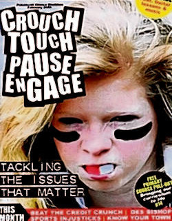
Instantly the connotations for this magazine for me say 'sports college' or also 'anti bullying campaign' there aren't many signs that suggesting bullying other than the main picture. The fact that the girl has light blonde hair could suggest innocence but the black lines under her eyes and gum shield could suggest bully or it could be a mixture, she might be a soft and innocent little blonde girl who is getting bullied but she is 'tackling the issues that matter' to her. On the other hand there are also the connotations of this being a sports magazine, from the gum shield to the lines under the eyes. The masthead is bold and really stands out, it does make a statement, but it does look as if it could just be a one off masthead, for instance it could be changed every week depending on the main article. Compared to the first cover this one is a lot bolder and grabs my attention more, the girl seems to have a story inside and I want to open the magazine and find out what the story is whereas the first magazine just looks dull and all about work. The colour scheme works well for this cover, the obvious black and white text and then the bold and bright reds and yellows, both either suggest love for red or blood and yellow again could represent innocence. There doesn't look to have been much editing on the central image, just a head shot that worked instantly. Overall the magazine is using a lot of techniques which a popular selling magazine would use such as the flash in the bottom right corner and also the banner accross the bottom and a main article.

The last text is different from them both, this magazine looks as if it is a school gossip column - 'Latest gossip around the school.' The editing is not good at all, the tree/leaves at the top look fake and the cover girls looks as if they are coming from nowhere. The lexis and font is straight forward and boring, there are bad punctual mistakes (?????! - !!!!!) It gets repetitive and compared to the other two, this one is extremely dull. There is nothing to the colour scheme other than greens and yellow, the colours don't even work well with one another. The pictures do use different camera angles, varying from a long shot and a mid-shot. To me this magazine just isn't very good, I personally would have not made the copy slanted, I would have stuck with the green background but ensure that the copy was bold and easy to read. For example, the masthead which is at the bottom of the magazine is the only bit of copy which stands out, so black obviously works on a green background. There are four featured articles, but I cannot tell which one is the leading article, so maybe making one section of the text bolder would have shown off the leading article. This magazine could make a few simple changes and work extremely well, it is just simple things that could have been changed.
Overall cover two was the best magazine to me. It had a bold masthead and leading article. The central image was strong as it was a simple shot that clearly worked without editing. The connotations from the colour scheme are also strong. You can see that there is a story behind the central image and too me, I would be willing to buy that magazine and find out the story.
.
No comments:
Post a Comment